
Purple Wallpaper
Purple wallpaper brings a strong presence to a room without feeling unwelcoming, balancing cool and warm undertones better than almost any other color. Whether the shade is pale lilac or rich eggplant, there's a version that fits nearly any style.



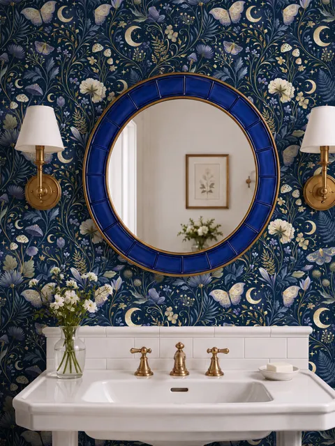
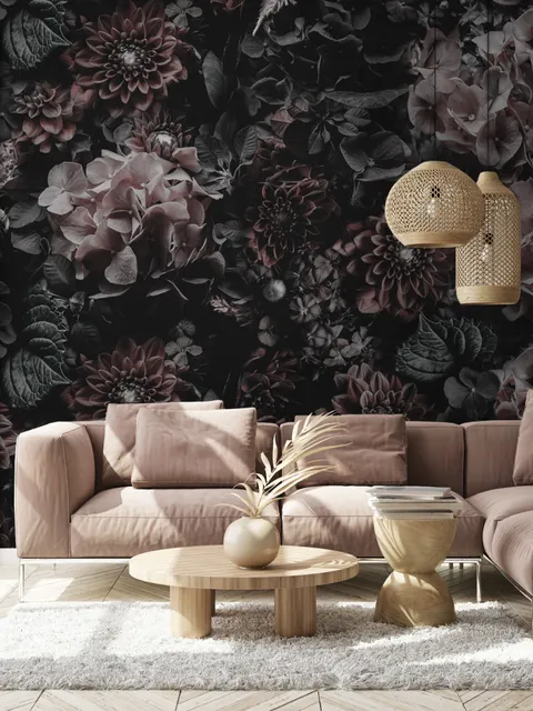
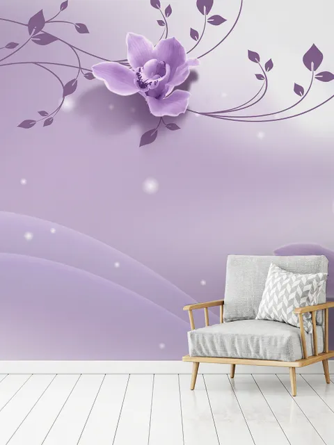
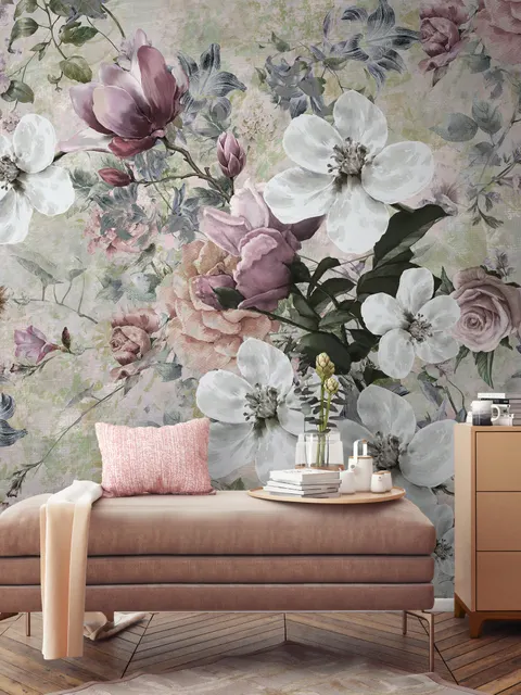
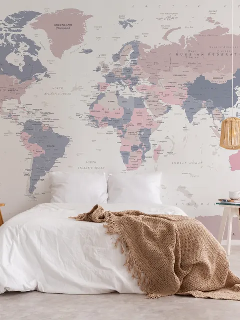
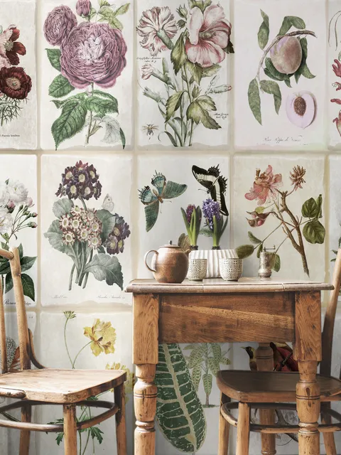
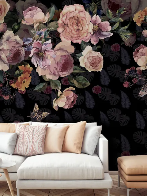
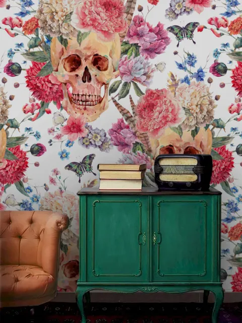
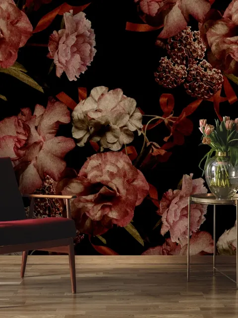
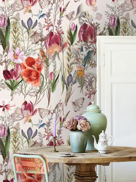
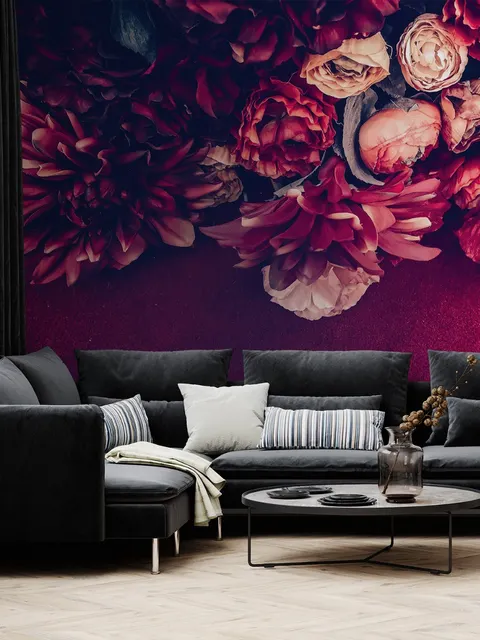
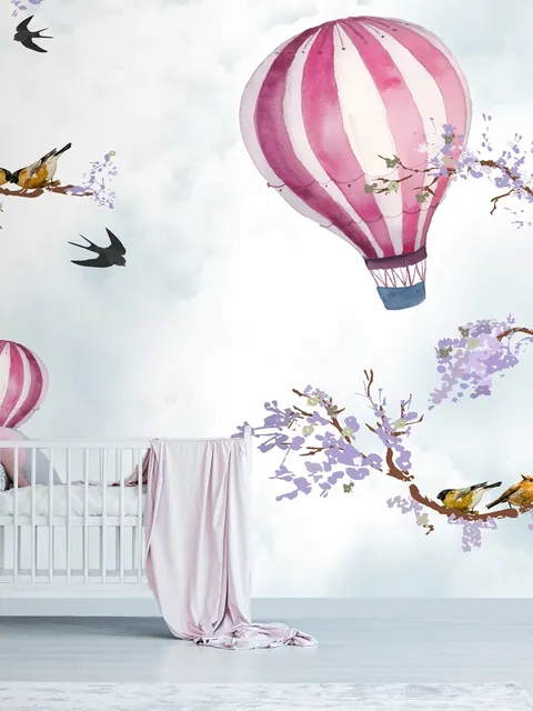
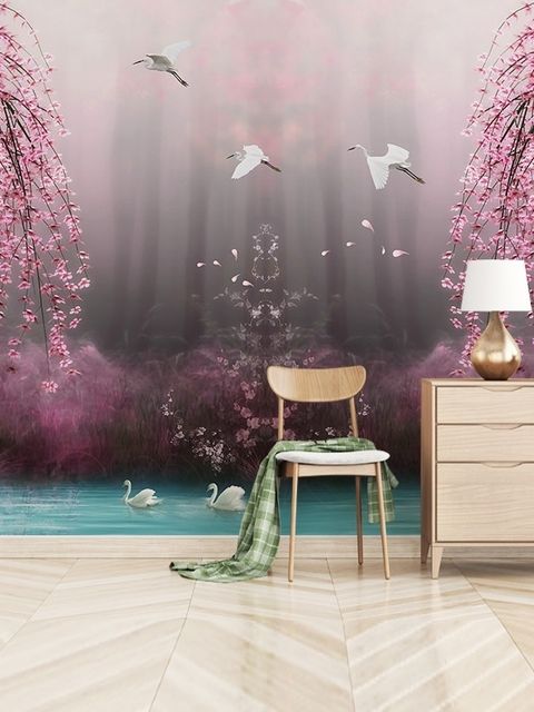
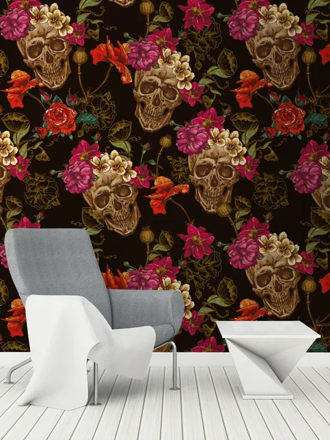
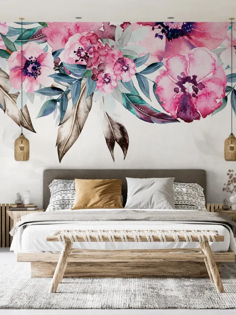
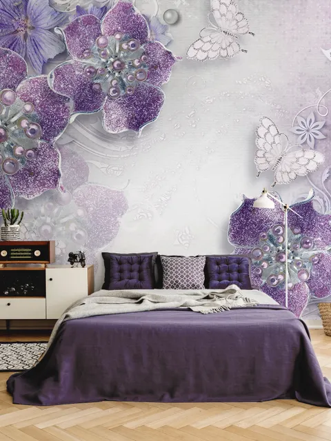
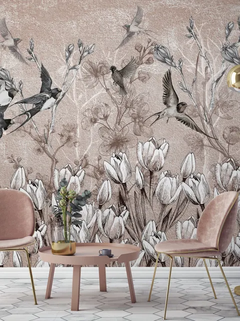
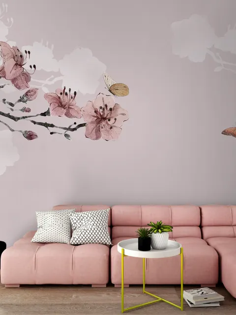
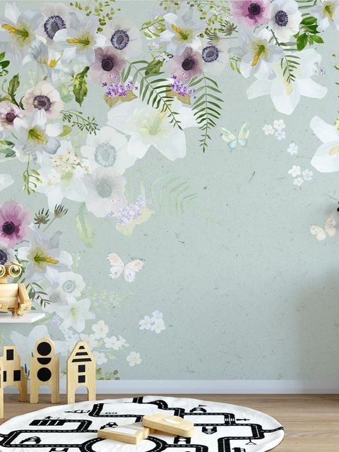
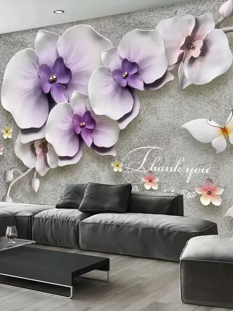
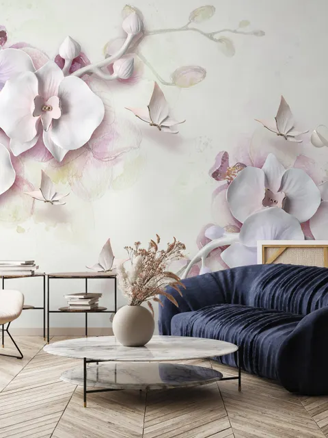
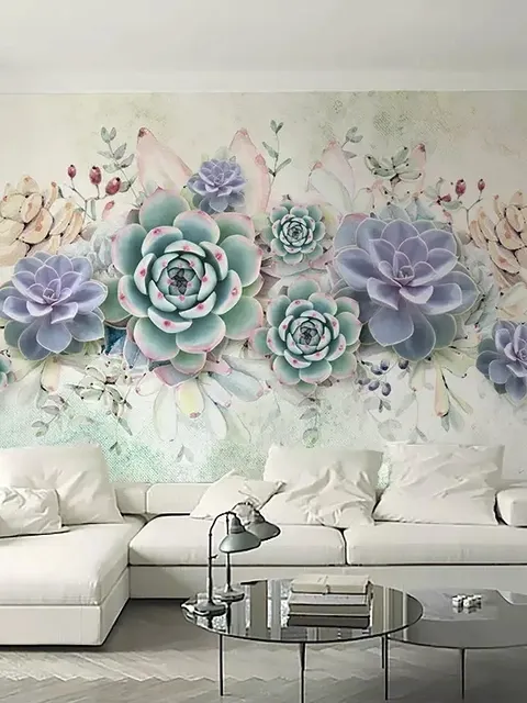

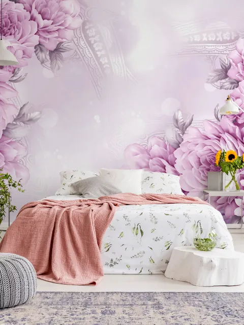
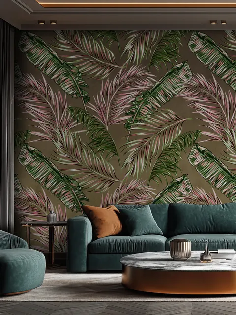
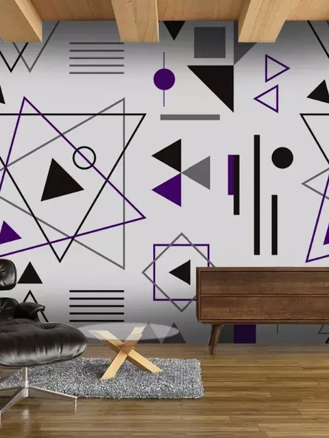
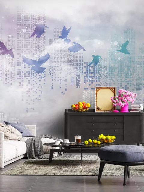
Purple Wallpaper for Bold, Balanced Character
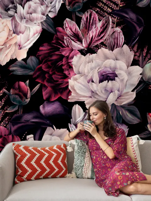
Most colors settle into the background, but purple tends to hold its own while still feeling welcoming rather than overwhelming. That balance comes from its mix of cool and warm undertones, which is part of why purple wallpaper works in spaces as different as a calm nursery and a bold, modern living room. Some of the most popular purple designs at Wallmur lean into that range too, from soft, watercolor florals to bolder abstract patterns with feathers or geometric shapes.
Where Purple Wallpaper Works Best
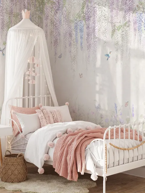
Purple wallpaper fits into more rooms than people usually expect. Hallway wallpaper in a light floral or textured purple design turns a narrow passage into something cozier, especially with enough natural or artificial light to keep the space feeling open. Living room wallpaper in geometric or abstract purple patterns makes strong feature walls behind a sofa, fireplace, or TV unit, and pairs especially well with wood or concrete elements. Nursery wallpaper in a softer, pastel purple with patterns like butterflies, stars, or clouds keeps the room cheerful without losing a sense of calm. Kitchen wallpaper in purple pairs well with metal, white, or wood finishes, and a fruit, floral, or textured print adds character without overwhelming the space. A single dark, dramatic purple accent wall can also be enough on its own, since purple isn't tied to a specific age or gender, which makes it a safe choice for shared spaces like dining room wallpaper, guest rooms, and open-plan interiors.
Best Mood for Purple Wallpaper
Purple sits in an unusual spot on the emotional spectrum, since it can lean either way depending on the shade. Pale lilac and soft lavender read as calming, closer to how a pastel blue or sage green would feel in a room. Deep violet or eggplant leans richer and more energetic, closer to how a bold jewel tone reads. That range is exactly why purple can work in a restful nursery and a lively living room using the same base color, just at different points on the shade spectrum.
Color Combinations That Work with Purple Wallpaper
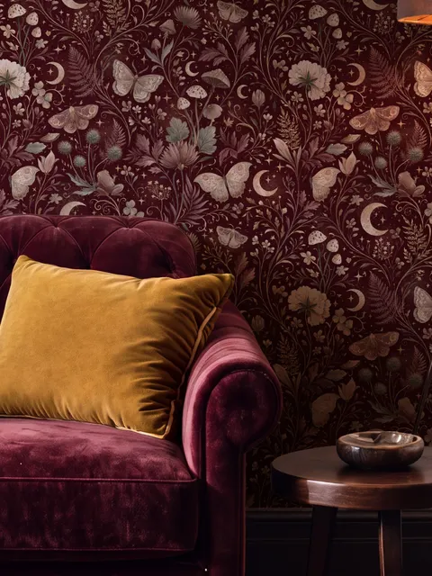
Purple blends more easily than most people expect. White, gray, and beige create a calm, neutral base that lets a purple pattern stand out without extra contrast. Yellow wallpaper, mustard, or gold wallpaper add warmth and make purple feel richer rather than cooler. Deep green wallpaper or olive creates a bolder, more dramatic contrast, while brass or silver accents add a touch of elegance without competing with the wallpaper itself. That range of pairings is part of why purple suits minimalist, classic, and eclectic interiors equally well.
Purple Compared to Pink
Purple and pink wallpaper sit close together on the color wheel, and lighter purples like lilac or lavender can blur into pink territory. The easiest way to tell them apart is warmth, pink leans warmer and softer, often reading as sweet or romantic, while purple, even in pale shades, keeps a cooler undertone that reads as more sophisticated or moody. Choose pink for a softer, warmer feel, and purple when you want a similar softness with more depth and less sweetness.
Frequently Asked Questions
Dark floral hydrangea, 3D purple flowers, cherry blossom with butterflies, and abstract feather designs are among the most popular purple wall coverings. Most of these pair a rich purple ground with a softer floral or watercolor pattern.
The room usually points you toward the right style. Floral purple wall murals suit kitchens well, while striped or more graphic purple designs work nicely in bedrooms and libraries. Softer, pastel purples suit nurseries and calmer spaces, while deeper, richer purples suit bolder living rooms and feature walls.
Purple works especially well in living rooms, nurseries, kitchens, hallways, and dining or guest rooms. Since it isn't tied to a specific age or gender, it also suits shared and open-plan spaces where a more neutral bold color is useful.
Purple pairs well with white, gray, and beige for a calm base, with yellow, mustard, or gold for warmth, and with deep green or olive for a bolder contrast. Brass or silver accents add a touch of elegance without competing with the wallpaper.
Pink leans warmer and softer, often reading as romantic or sweet, while purple keeps a cooler undertone even in pale shades like lilac, which gives it a more sophisticated or moody feel. Choose pink for warmth and softness, and purple for a similar softness with more depth.