
Orange Wall Mural
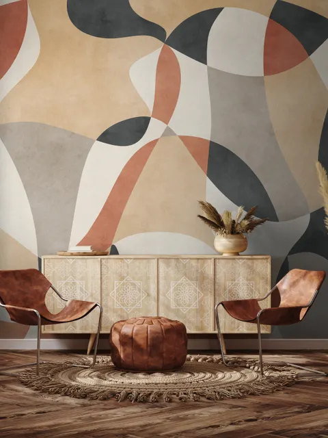
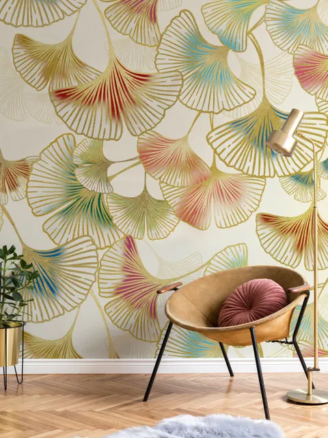
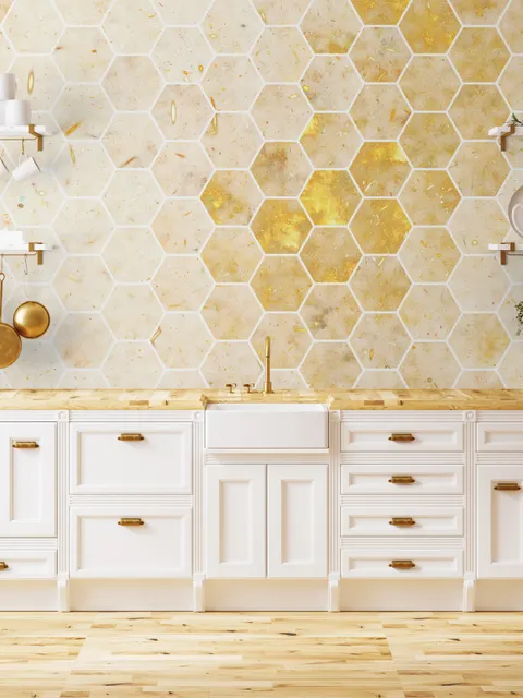
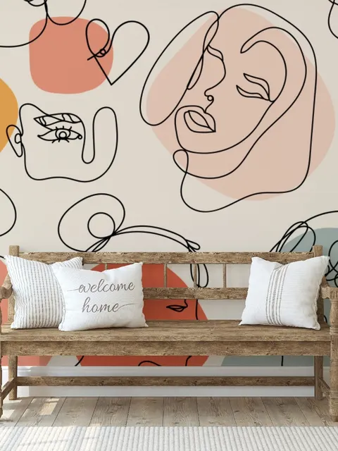
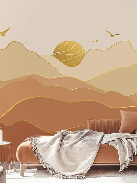
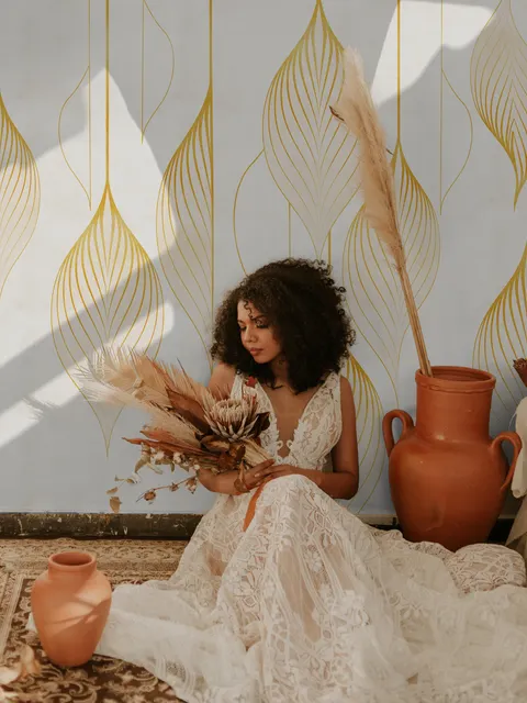
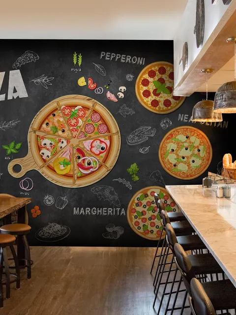
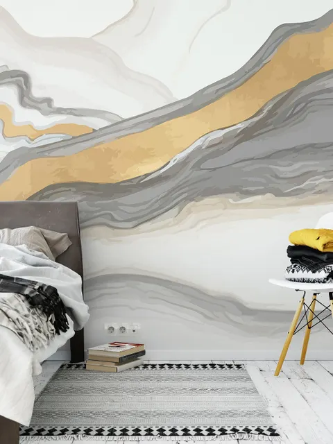
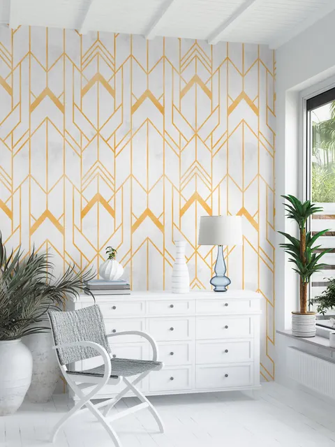
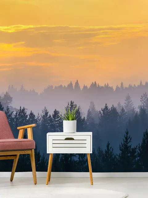
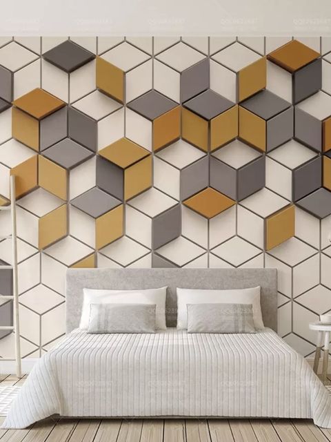
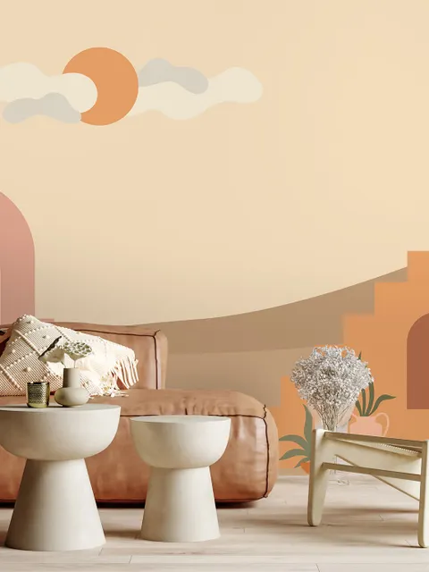
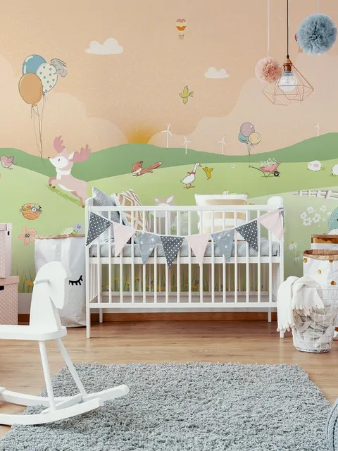
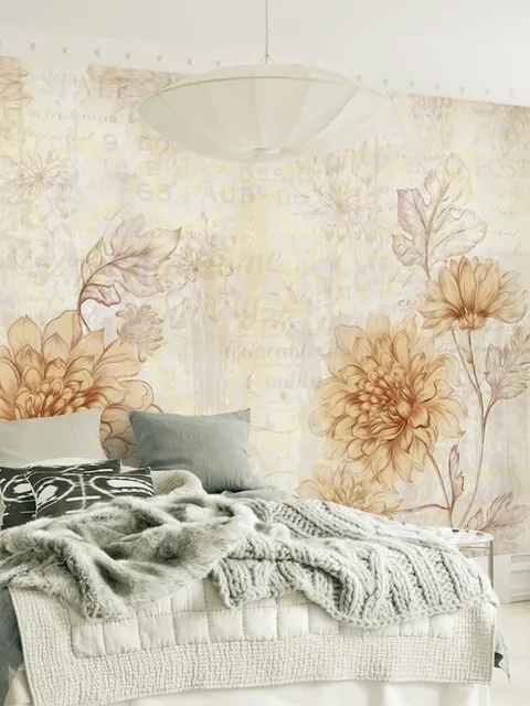
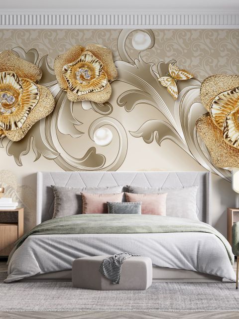
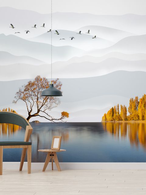
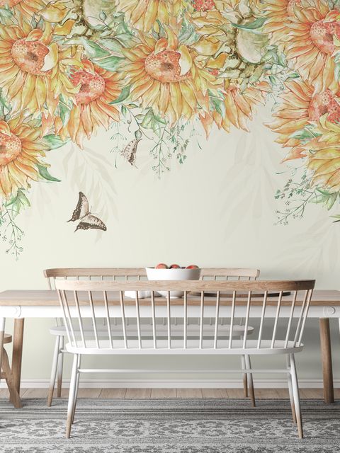
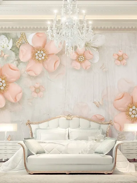
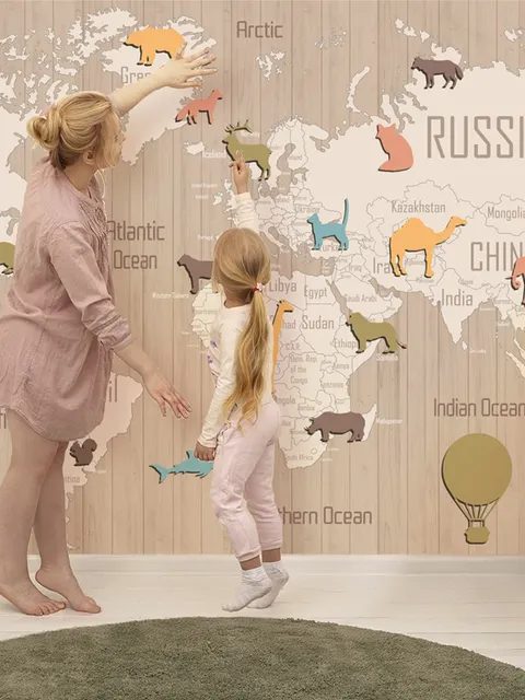
Orange wall mural is warm imagery for rooms that need energy and glow. Wallmur offers soft apricot and richer amber designs for kitchens, entries, and creative nooks.


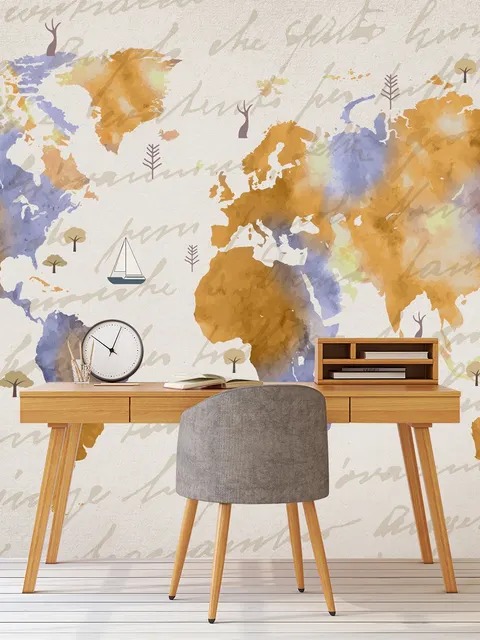
Why Orange Works
Orange can be both bold and calm, depending on the shade. It carries yellow's cheerfulness and red's vibrance, so a room gains energy without feeling harsh. Deeper tones read mature and modern in dining room wallpaper and kitchen wallpaper, while lighter shades like apricot or peach add optimism and ease to a space without overwhelming it.
Best Rooms and Mood for Orange Wallpaper
Orange sits close to yellow on the energizing end of the mood spectrum, though it carries more warmth and intensity, which is why it tends to feel bold rather than simply bright. Living room wallpaper with a single orange wall mural can anchor the longest wall and set the tone for the whole space. In kitchens, pairing orange with black or charcoal details feels warm and welcoming rather than overpowering. For studies, home office wallpaper, and smaller nooks, softer tints keep the space bright without tipping into overstimulating.
Design Tips for Orange Wallpaper
Choose murals with visible print, pattern, or texture to add depth, and balance vivid fields of color with white surfaces or pale woods so the wall doesn't compete with everything else in the room. If a room is narrow, a focused orange mural usually works better than a sprawling scene, while large graphics stay legible from across the room in more open layouts. Warm lighting enriches terracotta and amber tones especially well, and mixing matte finishes with brushed metal adds contrast without extra color. Repeating one accent color from the mural elsewhere in the room, whether in linen, pottery, or trim, helps tie the whole scheme together.
Orange Compared to Yellow
Orange and yellow wallpaper sit next to each other on the color wheel and both lean energizing, but orange carries more warmth and a bolder presence. Yellow reads as bright and cheerful without much weight behind it, while orange feels richer and more grounded, closer to how a spice or an autumn leaf reads than a sunny day. Choose yellow when the goal is light, easy brightness, and orange when the room can handle a bit more intensity and depth.
Planning Your Orange Wallpaper
A mid-tone orange mural with soft contrast is usually the safest pick across different lighting conditions, and tends to photograph well year-round. For a bolder statement in a social space, a graphic orange mural behind seating adds energy without crowding the layout. Browsing designs by tone, from pale apricot to deeper rust and terracotta, and matching the scale of the pattern to the wall's length is the easiest way to narrow down a choice before committing to a full room.
Frequently Asked Questions
Orange wallpaper ranges from soft, muted apricot and peach tones to deep, saturated amber and terracotta shades. It adds warmth and energy to a space, and depending on the shade, can feel either lively and bold or calm and grounded.
Yes, generally. Orange sits on the warmer, more energizing end of the color spectrum, closer to red than to blue or green. Lighter, more muted tones like apricot bring a gentler version of that energy, while deeper, saturated shades feel bolder and more intense.
Kitchens, dining rooms, living rooms, and creative or social spaces suit orange particularly well, since these are areas where energy and warmth are usually welcome. Softer, muted tones also work in home offices or smaller nooks where a gentler version of that warmth is preferred.
Not necessarily, but the shade and pattern matter more in a small space. A focused mural rather than a sprawling scene, paired with lighter furniture and trim, keeps a small room feeling warm without feeling cramped. Muted or mid-tone oranges are generally easier to live with in tighter spaces than very saturated, high-contrast designs.
White and pale wood tones balance orange without competing with it, while black or charcoal details add a more grounded, modern contrast. Brass or warm metal accents pair naturally with orange's warmth, and repeating one accent color through the room's textiles or decor helps tie the scheme together.