
Typography Wallpaper
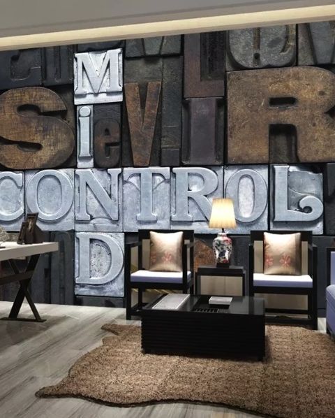
How to Choose Typography Wallpaper by Design
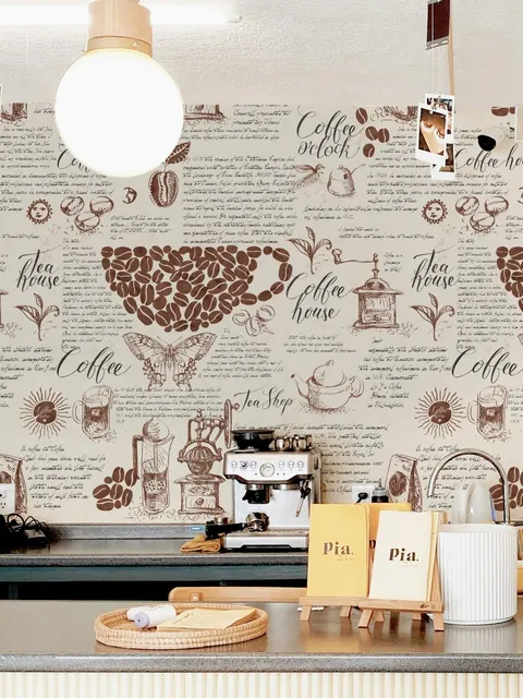
Typography wallpaper can be built around one short phrase or packed with letters, numbers, posters, and smaller text. Before choosing, look at what needs to stay readable once the design is on the wall.
-
Quotes and slogans: check where the main words sit. A headboard, desk, or shelf can easily cover the part that gives the design its meaning.
-
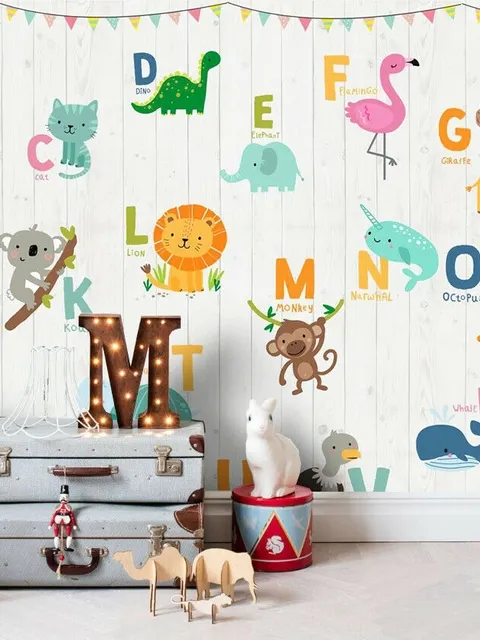
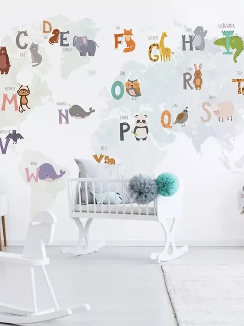
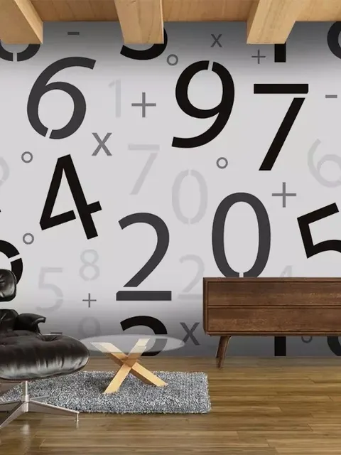
Alphabet and number designs: useful when the lettering itself is part of the theme, especially in study spaces or younger rooms.
-
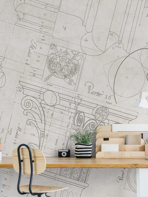
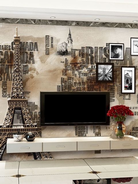
Poster and collage styles: these contain more small details, so judge them from the full preview rather than one enlarged section.
-
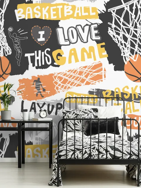
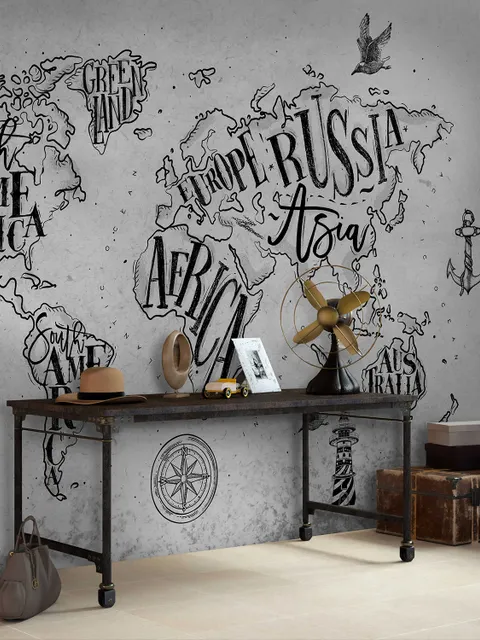
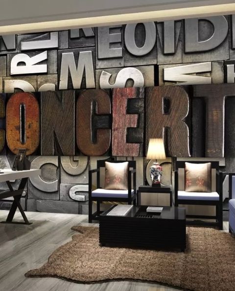
City, sports, and music themes: look at the placement of names, logos, and key words. Those details should stay visible after cropping.
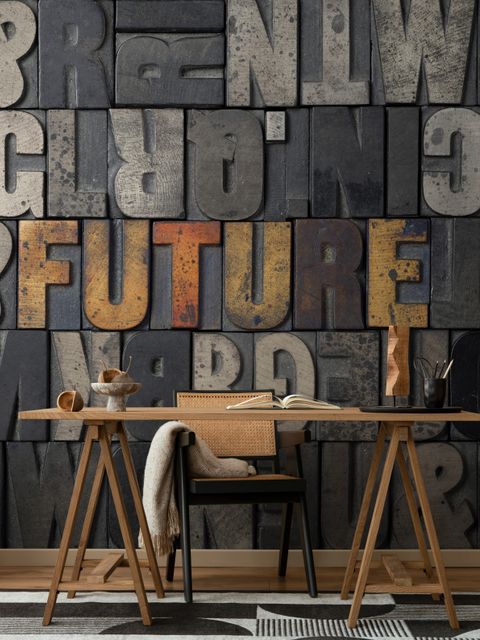
Some typography design wallpaper is meant to be read immediately. Other designs use letters more like shapes or graphics. That difference is worth checking before you choose by color alone.
Typography Wallpaper Size, Readability, and Placement
Text size changes a lot once a design covers a full wall. Large lettering is easier to read from across the room, while dense text wallpaper usually looks more like a graphic pattern from a distance.
Contrast matters as well. Black text on white has a stronger effect than gray lettering on beige or another close color combination. If you want a quieter wall, minimalist typography wallpaper with fewer words and more empty space is easier to use. Aesthetic typography wallpaper with layered text, posters, or mixed fonts will feel much busier.
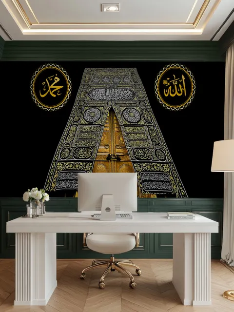
For a typography wall mural, check the complete layout before ordering. The main phrase should not end up behind a bed, monitor, wardrobe, or other large furniture.
Frequently Asked Questions
Bedrooms, offices, study areas, gaming rooms, and creative spaces are all good options. The best room depends on the message and how much of the wall will remain visible.
Yes. Quotes, sports themes, alphabet designs, numbers, and poster-style graphics all suit these spaces. For a study area, avoid very dense text directly behind the desk if you want a calmer background.
Large words, slogans, and detailed typography usually need only one main wall. Smaller or lower-contrast designs are easier to repeat around the room.
Non-woven suits a more permanent update. Peel and stick is useful on a smooth wall when easier removal matters. Textured options add more surface detail without changing the typography itself.