
White Wall Murals
White wallpaper doesn't have to mean plain or boring walls. With the right texture, pattern, or accent color, white can feel just as warm and interesting as any bolder shade.


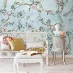

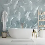
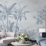
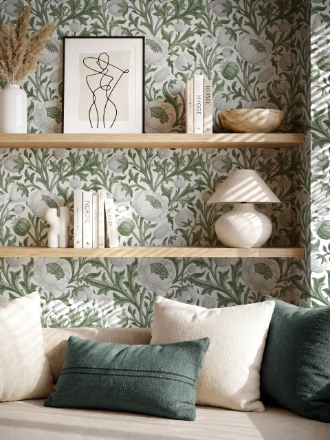
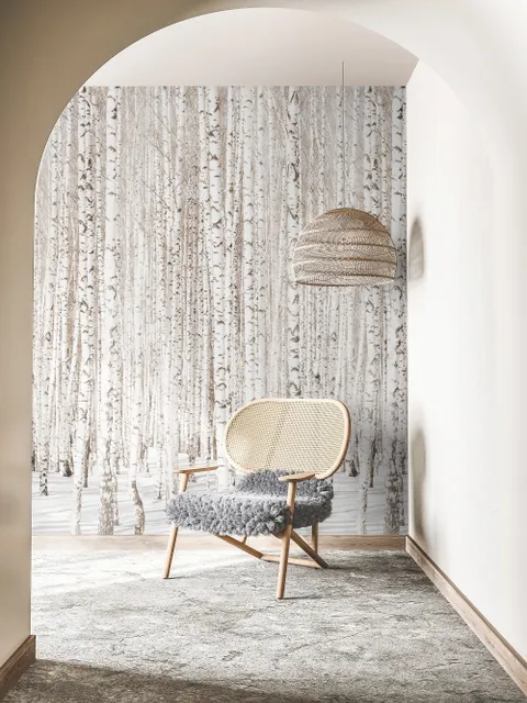
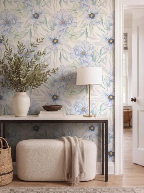
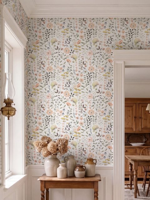
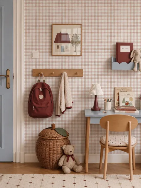
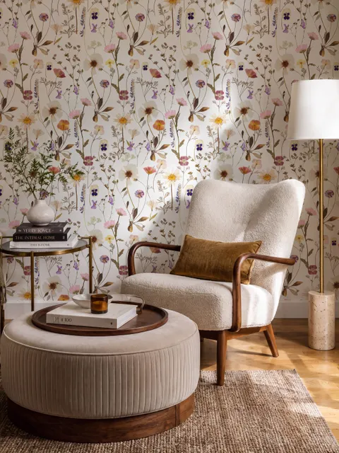
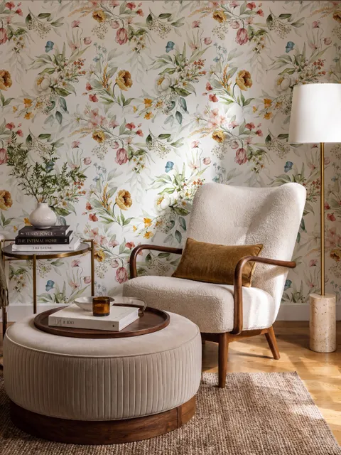
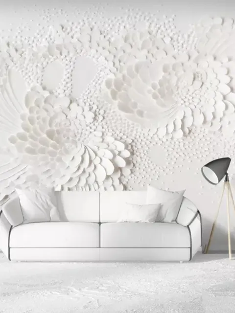
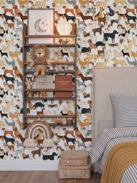
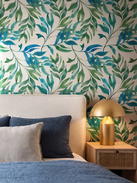
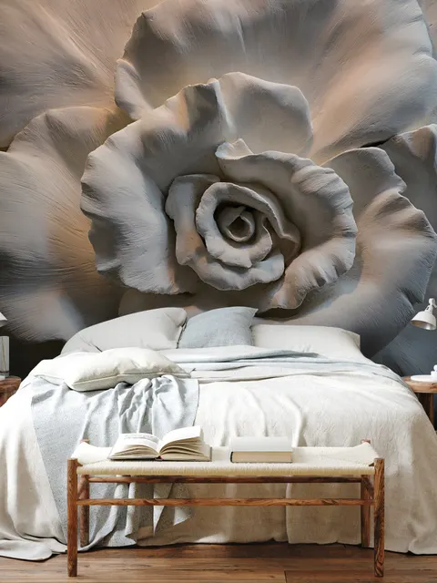
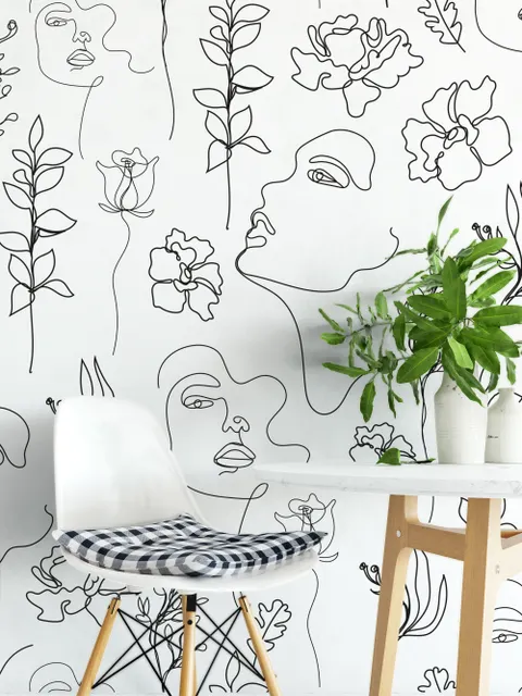
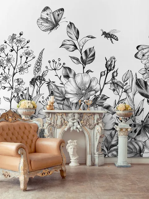

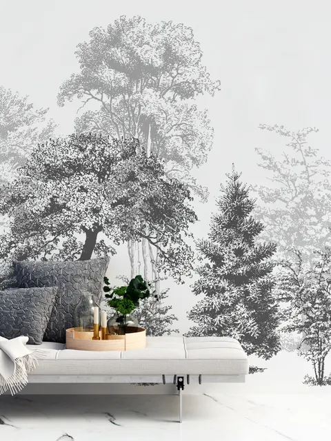
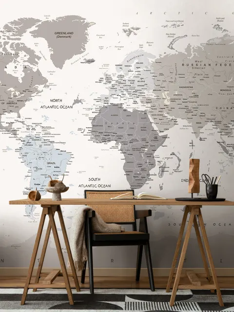
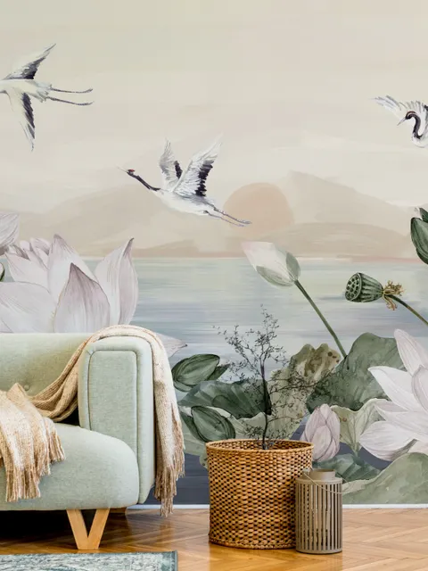
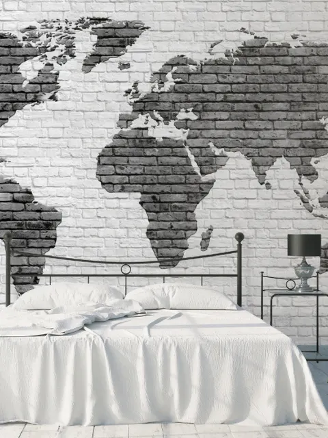
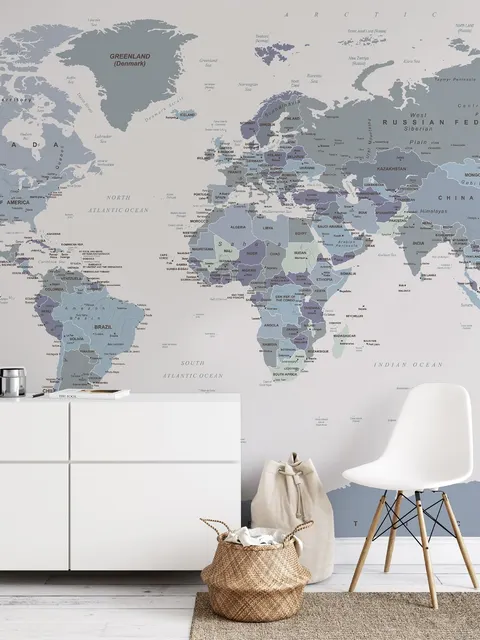
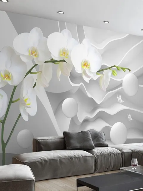
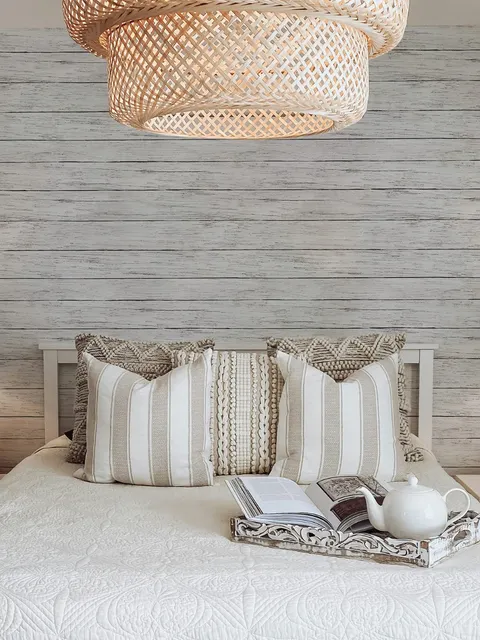
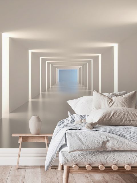
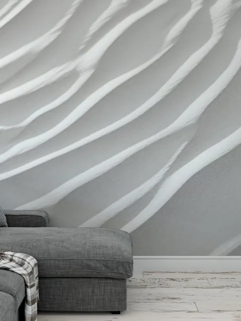
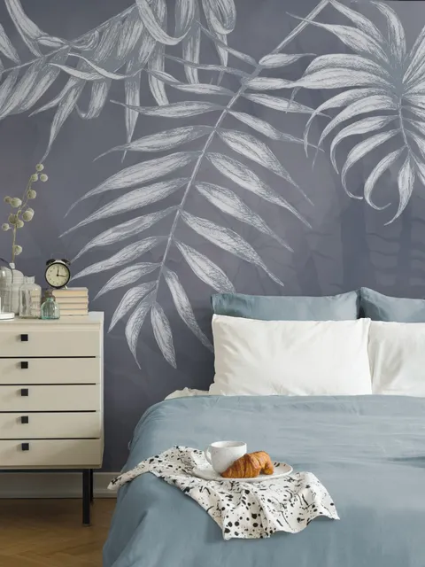
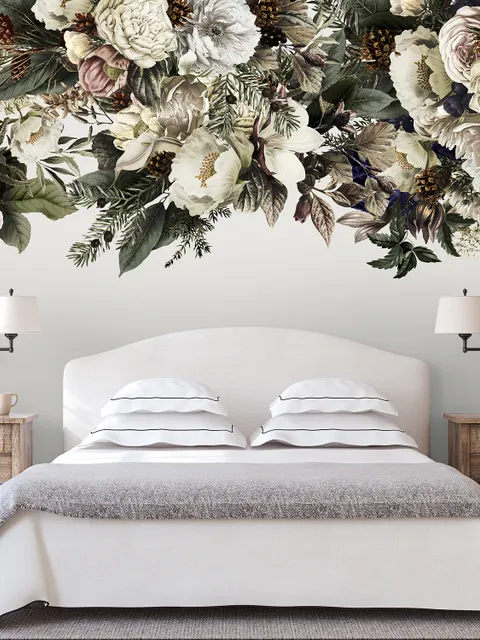
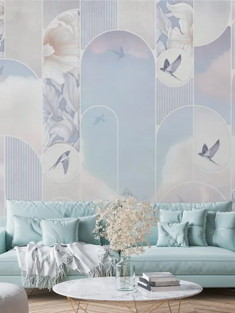
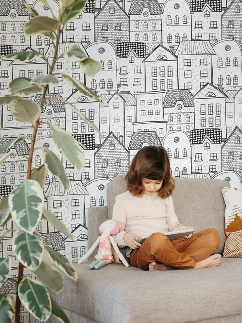
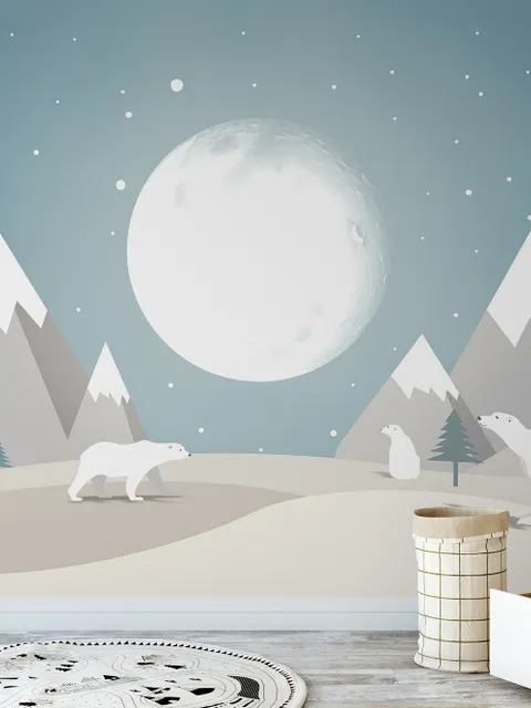
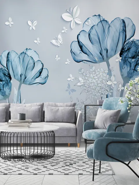
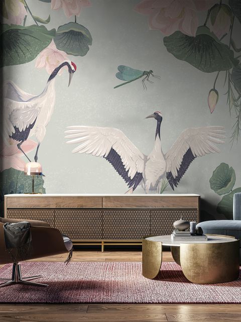
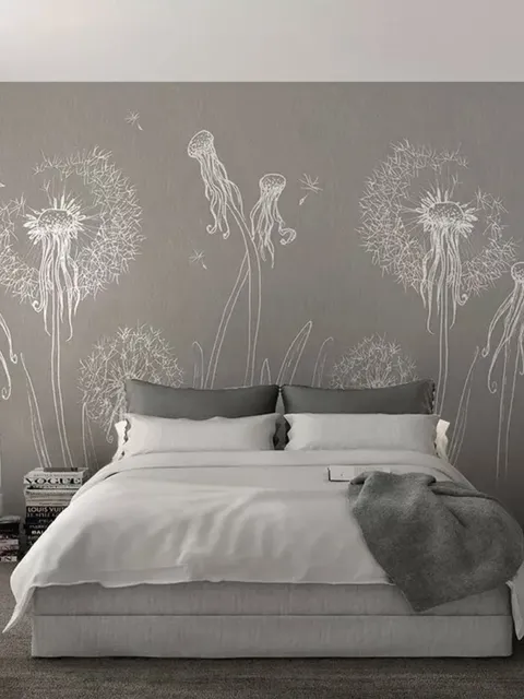
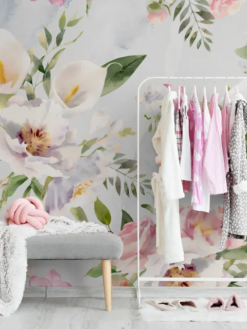
White Wallpaper for a Crisp, Versatile Base
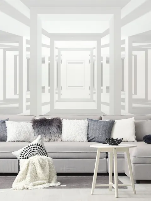
White brings a mix of qualities that few other colors manage at once, it reads as crisp, clean, and calm, but it can also feel warm and interesting with the right texture or pattern. Rather than treating white as an empty backdrop, the goal is to pick a shade and finish that adds depth on its own, then build texture and color around it. That's easier than it sounds, since white wallpaper stays relevant through changes in style far longer than more trend-driven colors, and it's no harder to maintain than most other wallpaper finishes.
Where White Wallpaper Works Best
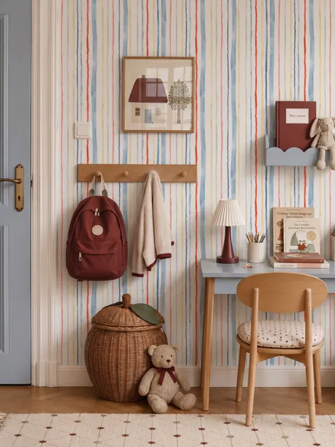
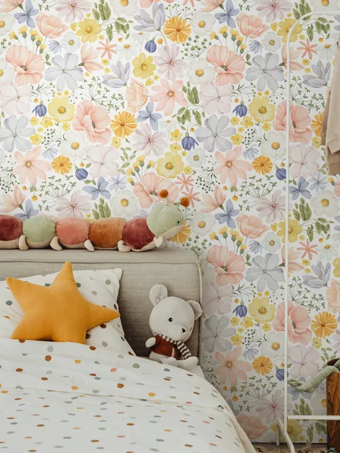
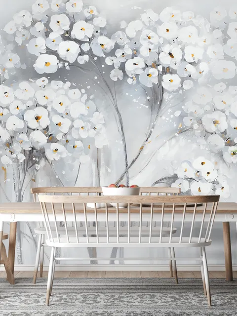
Patterned white designs suit bathroom wallpaper particularly well, especially fun or abstract patterns that give the space a modern feel, or nautical-style prints with a touch of vintage charm for a more nostalgic bathroom. For anyone drawn to botanical designs, large white floral wallpaper gives you a strong base to finish with accessories and accent colors of your choice. In smaller rooms, a white mural that covers the visible part of the space, paired with a few bolder elements elsewhere, keeps the room feeling open while still adding personality. White stripes remain a dependable choice too, and work well in almost any room, including kids' room wallpaper, where they add structure without feeling too mature or too juvenile.
Best Mood for White Wallpaper
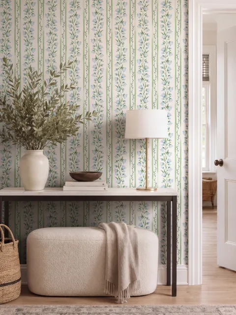
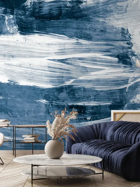
White itself doesn't carry a strong emotional pull the way a saturated color does, it's closer to a blank stage that takes on the mood of whatever accents surround it. That's exactly why it pairs so easily with almost anything: green wallpaper for a fresh, natural feel, yellow wallpaper for warmth and energy, or blue wallpaper for a cooler, calmer read. Choosing white as a base and picking one accent color to repeat through the room is usually a more effective approach than trying to make the white wall itself the statement piece.
White Compared to Cream and Gray
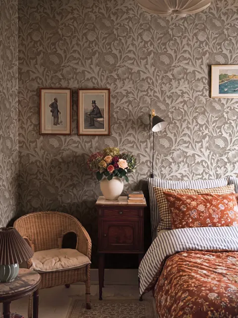
White, cream wallpaper, and gray wallpaper often get treated as interchangeable neutrals, but each behaves differently on a wall. White is the coolest and most neutral of the three, and without warm lighting or furniture, it can feel a little sterile or clinical. Cream adds warmth without much extra visual weight, which softens that clinical effect while still keeping things light. Gray leans more muted and grounded, trading some of white's brightness for a calmer, more subdued read. Choosing between them usually comes down to how warm or how bright you want the room to feel, rather than one being a better neutral than the others.
Frequently Asked Questions
White wallpaper is a flexible base that ranges from a completely clean, plain shade to detailed patterns and textures rendered in white. It works well on its own for a minimalist look, or as the backdrop for bolder accent colors, furniture, and accessories. Because it isn't tied to a specific trend, it also tends to stay relevant longer than more distinctive colors.
Yes, in most cases. Light colors like white reflect more of the available light in a room, which helps walls feel like they recede rather than close in. Pairing white wallpaper with light trim and simple furniture tends to amplify that effect, especially in smaller rooms.
White works in almost every room, though certain styles suit certain spaces. Patterned or nautical white designs suit bathrooms well, floral white patterns work nicely in bedrooms and living rooms, and white stripes are a safe, versatile choice for kids' rooms, hallways, and shared spaces.
Not particularly. White wallpaper is generally no harder to keep clean than other colors, and most designs can be wiped down gently with a soft cloth if they pick up dust or light marks. The idea that white is especially high-maintenance is more of a myth than a practical concern.
White pairs easily with almost any color, since it acts more like a neutral base than a color that competes for attention. Green brings a fresh, natural feel, yellow adds warmth and energy, and blue creates a cooler, calmer atmosphere. Picking one accent color and repeating it through a room's furniture and decor usually works better than mixing several accents at once.