
Blue wall murals
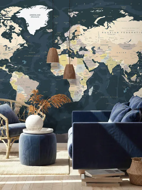
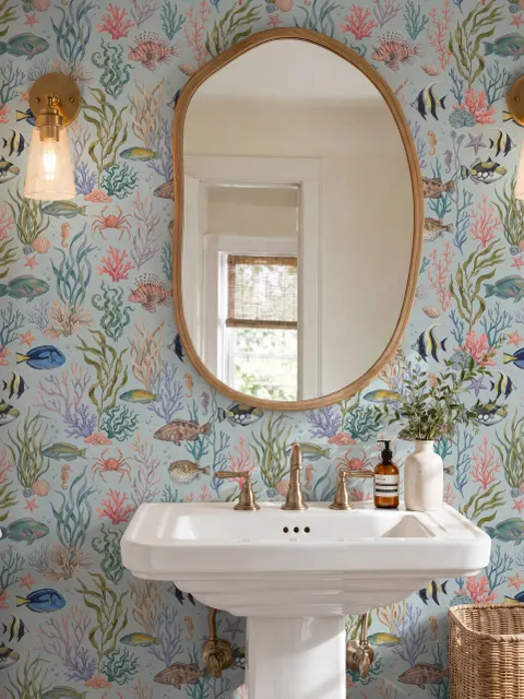
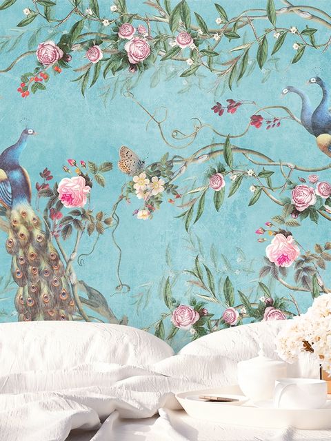
Blue wallpaper works in nearly every room, from soft, calming light blue in a bedroom or lounge to bold, striking dark blue on a feature wall or in a kitchen. Its many shades, from sky blue to navy, make it one of the most adaptable colors for a home.

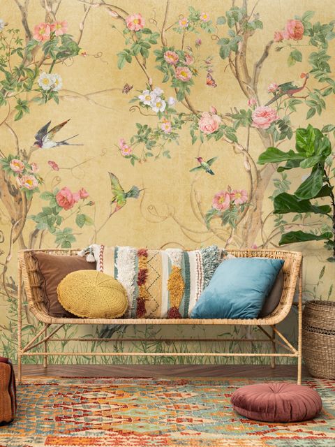
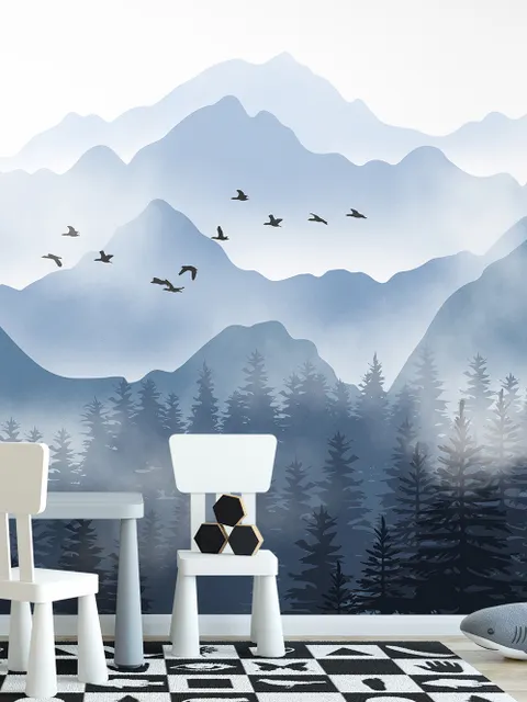
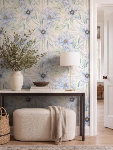
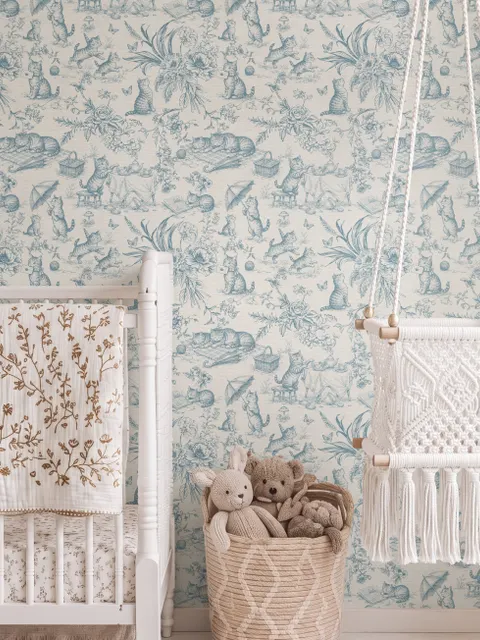
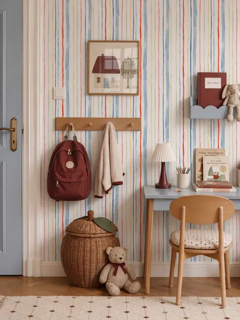
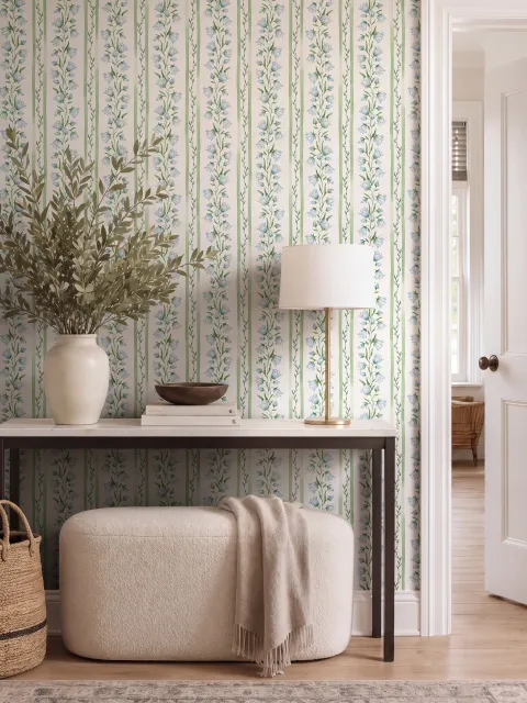
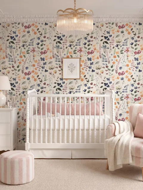
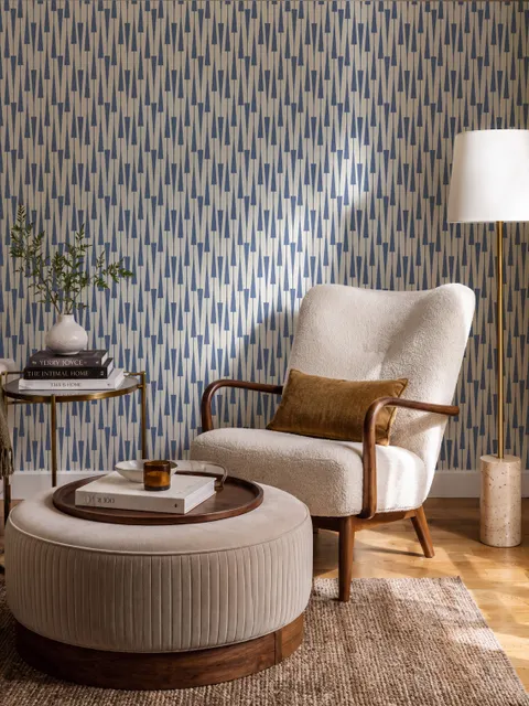
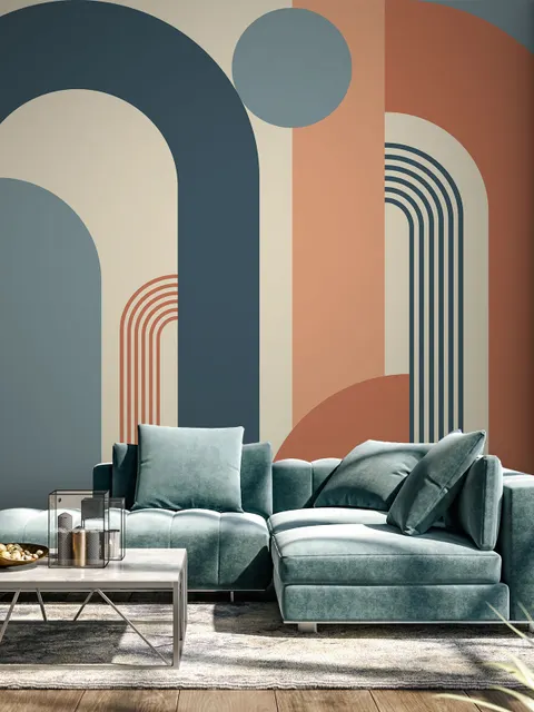
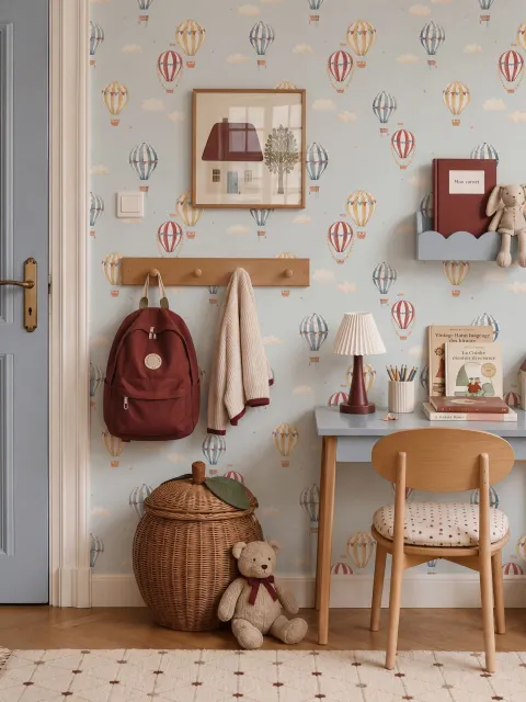
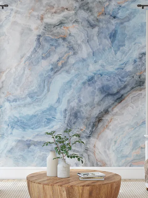
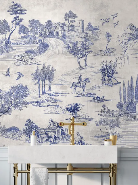
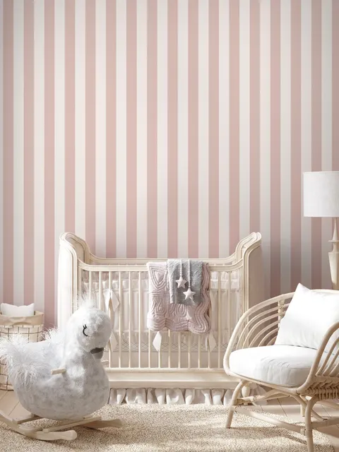
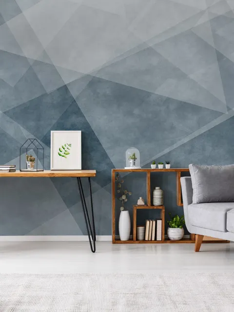
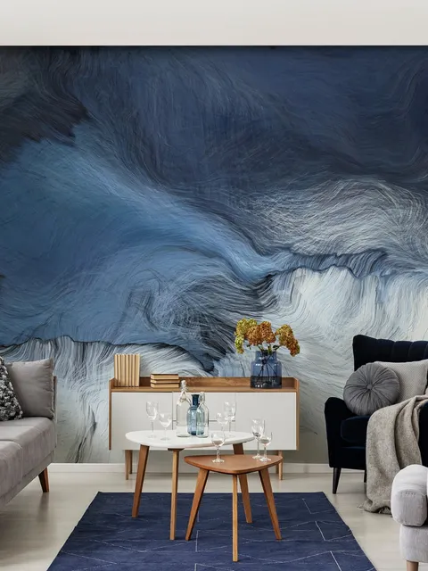
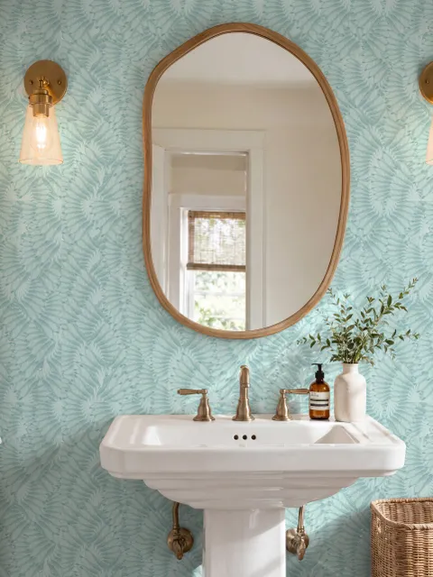

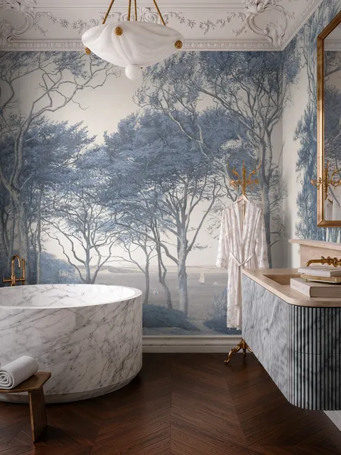
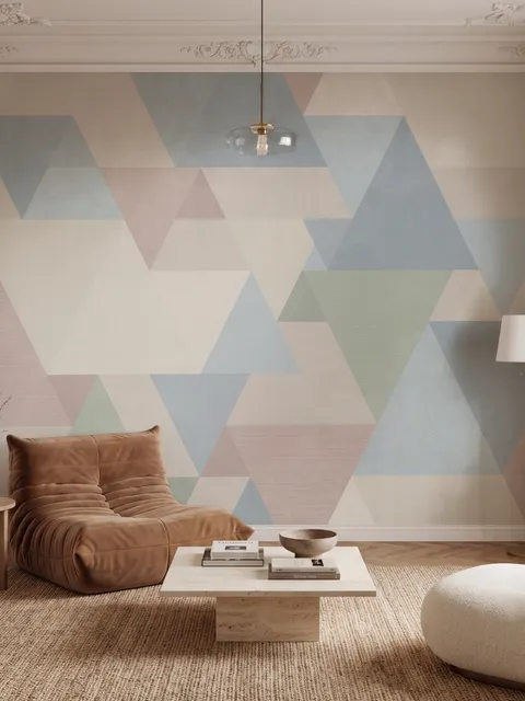
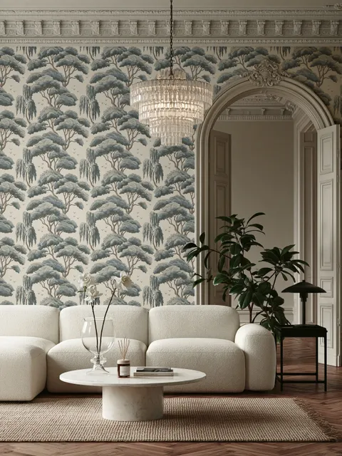
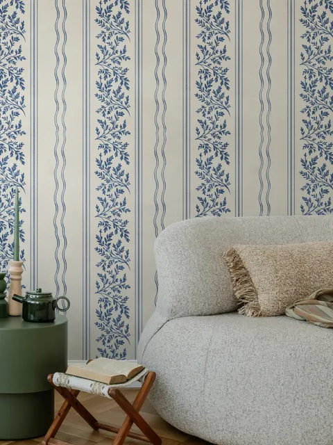
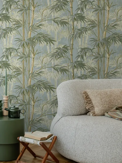
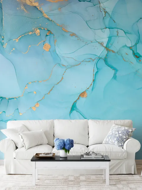
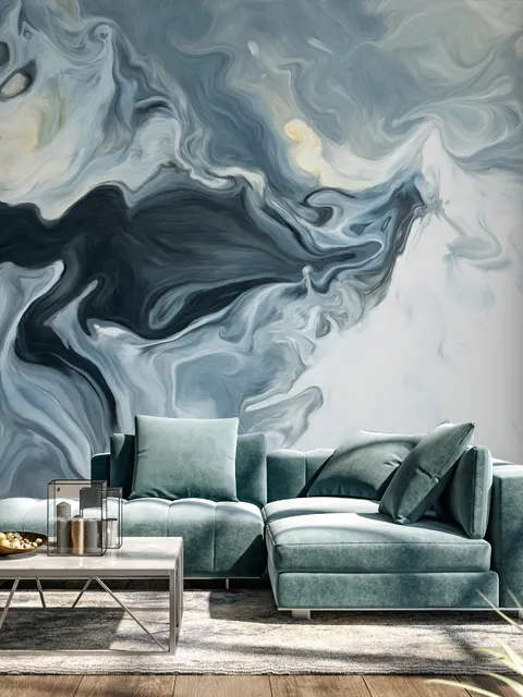
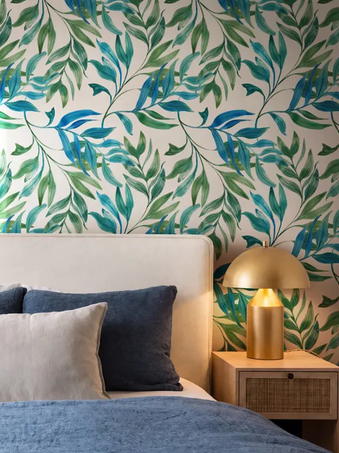
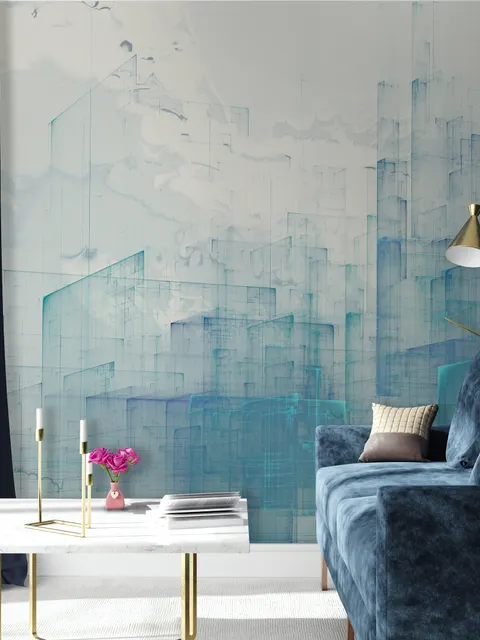

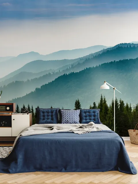
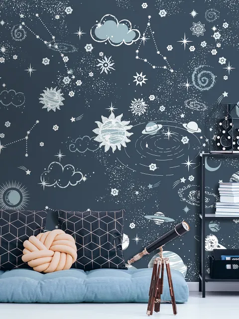
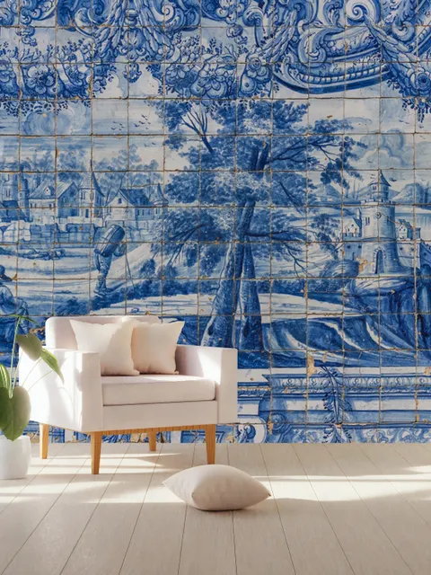

Blue Wallpaper for a Calm, Versatile Base
Blue is a non-threatening color that reads as peaceful and tranquil, which is part of why it feels so natural on a wall, it's the color of the sky and the sea, both associated with calm long before wallpaper existed. That same range, from soft sky blue to deep navy or turquoise, is what lets blue work equally well as a quiet backdrop or a bold, saturated statement.
Which Colors Pair with Blue Wallpaper
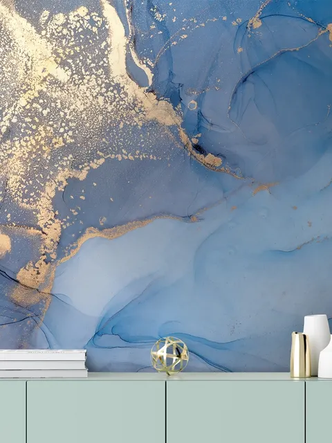
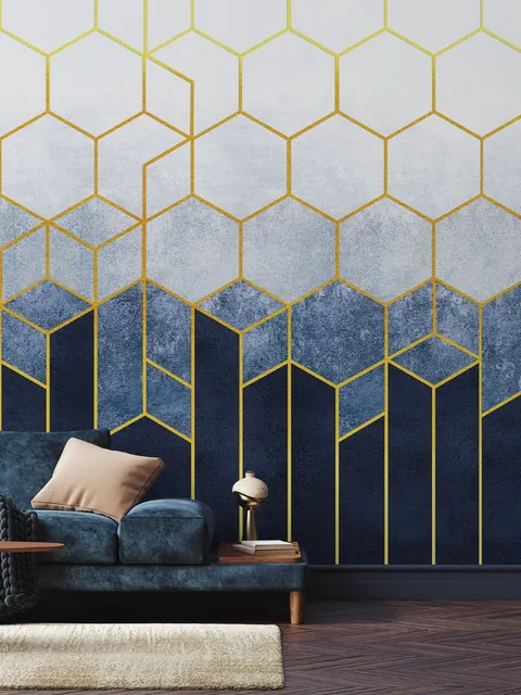
White complements almost any shade of blue, and the combination gives a room a bright, contemporary feel. Neutral tones like cream and tan work well with darker blue murals for a softer, less contrasty look, while gray or slate walls paired with light blue murals create an understated, urban feel. Metallic accents pair especially well with navy blue, adding a bolder, more daring edge to the room. The exact shade of blue also determines what else can be layered in, sticking to similar tones from the same color family keeps a room feeling cohesive, while adding splashes of white, whether in trim, ceilings, or furniture, makes the blue itself stand out more clearly.
Best Rooms and Mood for Blue Wallpaper
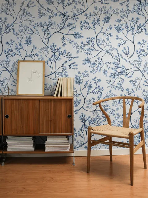
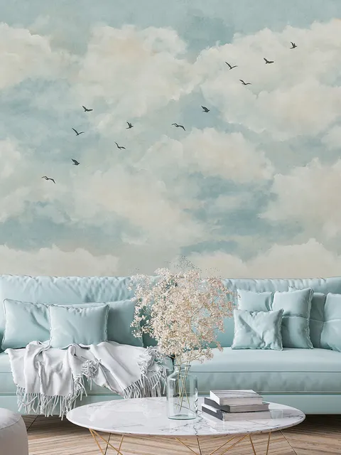
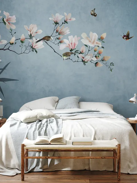
Light blue leans calming and works especially well in bedrooms and lounges, where the goal is usually rest rather than energy. Dark blue and navy read as bolder and more dramatic, which is why they suit feature walls and kitchens, spaces where a striking, confident look is often welcome. Blue murals come in a wide range of styles too, from butterfly and floral patterns to neon-bright aesthetics, though dark blue and abstract blue designs tend to be the most popular, since abstract patterns in particular can make a room feel larger and more open.
Blue Compared to Navy and Teal
Blue sits at the center of a small family of related colors on this site. Navy wallpaper is a deeper, more refined version of blue, and tends to feel more formal and grounded than a standard or lighter blue. Teal wallpaper blends blue with green, which softens blue's coolness and adds a slightly warmer, more coastal character. Choose standard blue for the widest range of shades and the most flexibility, navy when the room needs a more polished, elegant edge, and teal when a touch of green warmth is welcome alongside blue's calm.
Frequently Asked Questions
Blue wallpaper ranges from soft sky blue and powder blue to deep navy and turquoise, and it's popular because the color reads as calm and non-threatening in almost any shade. It works as a quiet, restful backdrop or a bold, dramatic feature, depending on how saturated the tone is.
Bedrooms and lounges suit lighter, softer blues for a calming feel, while kitchens and feature walls can carry darker blues or navy for a bolder, more dramatic look. Blue also works well in bathrooms, nurseries, and living rooms, since the color's calming quality suits almost any space in the home.
Yes, generally. Blue is widely associated with calm, largely because of its connection to the sky and sea, and lighter shades in particular tend to feel restful rather than stimulating. Darker or more saturated blues shift toward feeling bold and dramatic rather than purely calming.
Often, yes, especially with lighter or abstract blue patterns. Pale blues reflect light well and can help a wall recede, while abstract blue designs in particular tend to make a room feel more open and spacious than a busy, high-contrast pattern would.
White pairs with almost any shade of blue for a bright, fresh look. Cream and tan soften darker blues, gray or slate creates an understated, urban feel with lighter blues, and metallic accents add a bolder edge to navy in particular.